DECISION 01
A map at the centre of everything
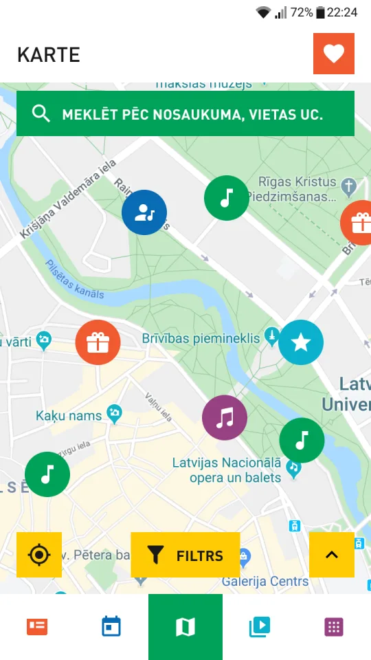
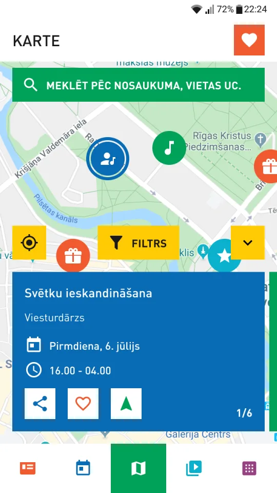
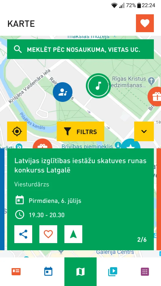
Every venue is a tappable pin, color-coded by type. Tap one to see what’s happening there, then filter or jump to details. In testing, the interactive map was the feature everyone liked most.
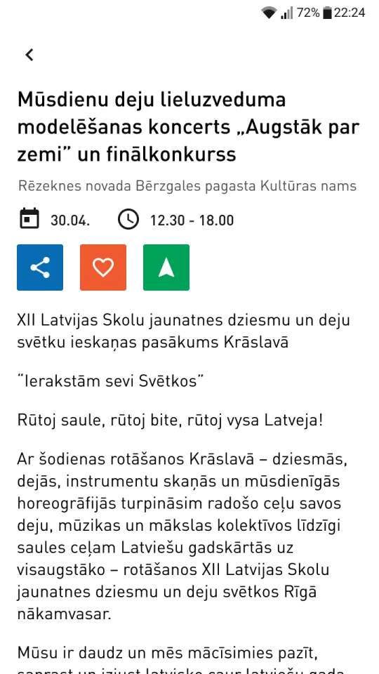
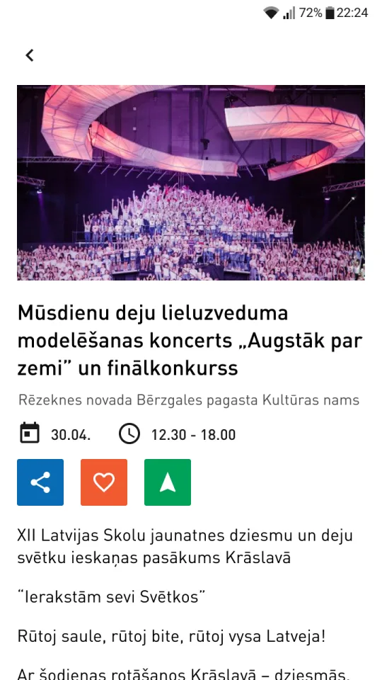
A pro bono app for the XII Latvian School Youth Song and Dance Festival — the programme, rehearsals, a live map and everyday essentials in one place, for participants, their parents and visitors.
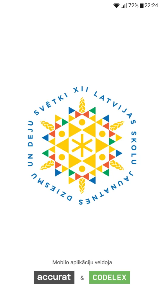
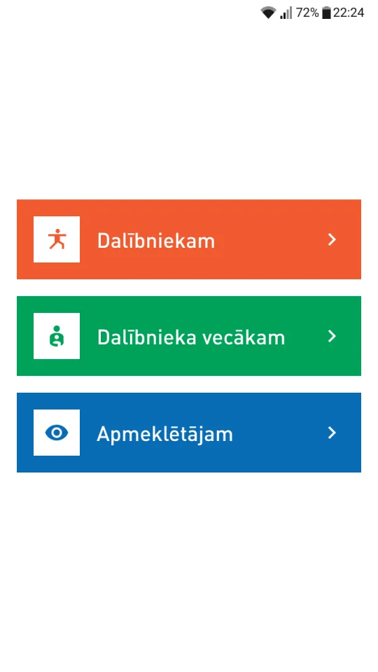
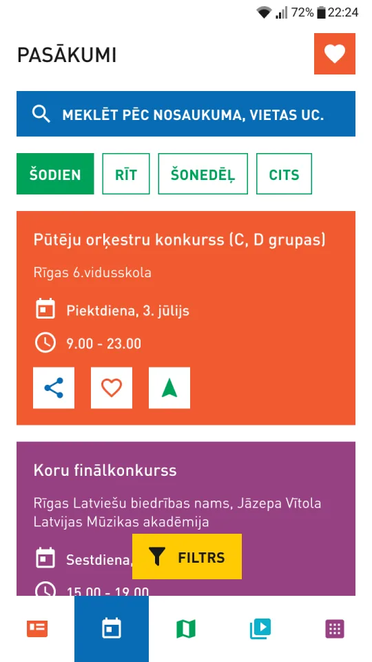
Song and Dance Festivals are huge, sprawling events: dozens of concerts, rehearsals and gatherings every day — and venues and times can change within the hour.
Information was scattered across channels, so nobody could follow everything. Participants risked missing rehearsals, parents lost track of where their kids were, and visitors couldn’t see what was on where.
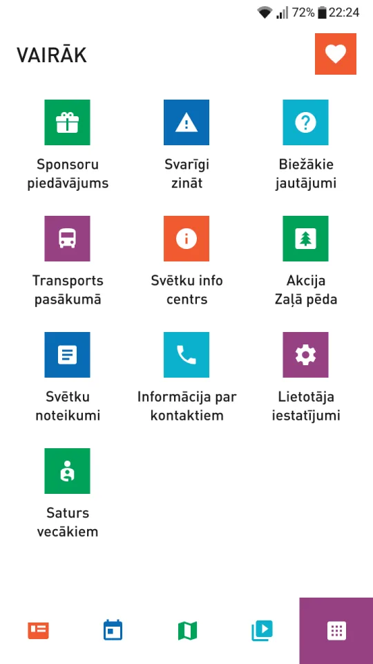
The young performers. Rehearsal and performance times and places in one place, even when they change within the hour — plus the basics: water, toilets and food.
Follow the events their kid takes part in, so they can keep track without calling every hour.
The whole programme on an interactive map — tap a venue to see the concert or performance happening there.
Stakeholder goals, existing data and known complaints.
Festival apps like Summer Sound and Positivus, plus international events.
Flows, navigation and features — explored in wireframes and discussions.
Reviewed regularly with stakeholders and developers.
Interviews and usability tests with 7 participants and 7 parents.
Participants didn’t struggle with the programme. They struggled to find water, toilets and food.
The brief started from the organisers’ point of view: help people find events. Interviews with participants turned it around — the app had to inform participants first. Essentials joined the map, and participants became the primary user.
Every venue is a tappable pin, color-coded by type. Tap one to see what’s happening there, then filter or jump to details. In testing, the interactive map was the feature everyone liked most.
On first launch you choose who you are — participant, parent or visitor. It’s one tap, and it lets each group start from what matters to them instead of digging through everything.
The client wanted the full festival palette in the interface. Instead of decorating with it, each color got a role in color-coding content — and red was kept away from anything that could read as an error or warning.
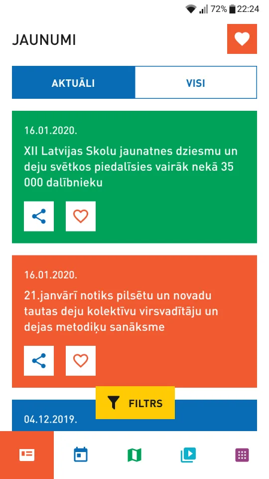
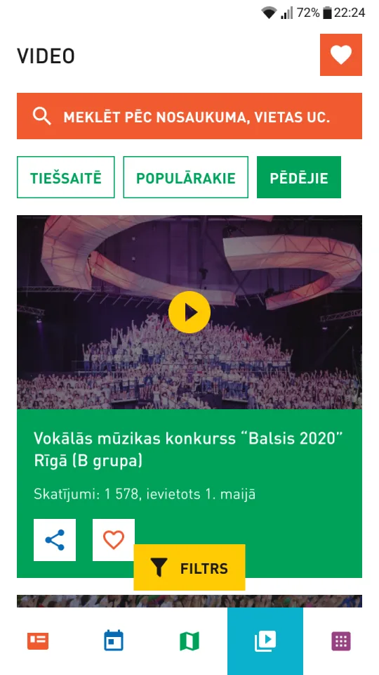
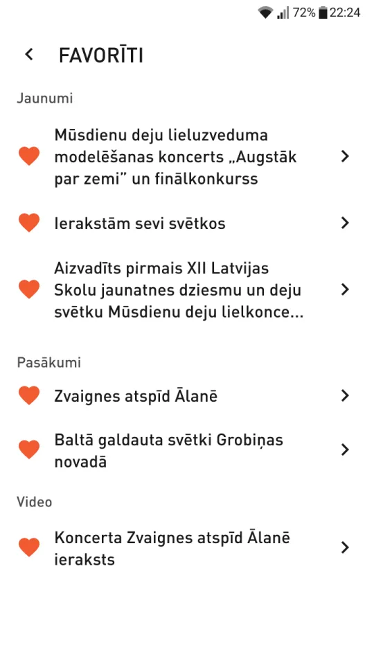
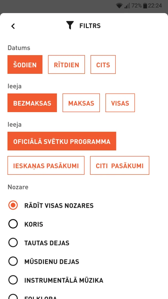
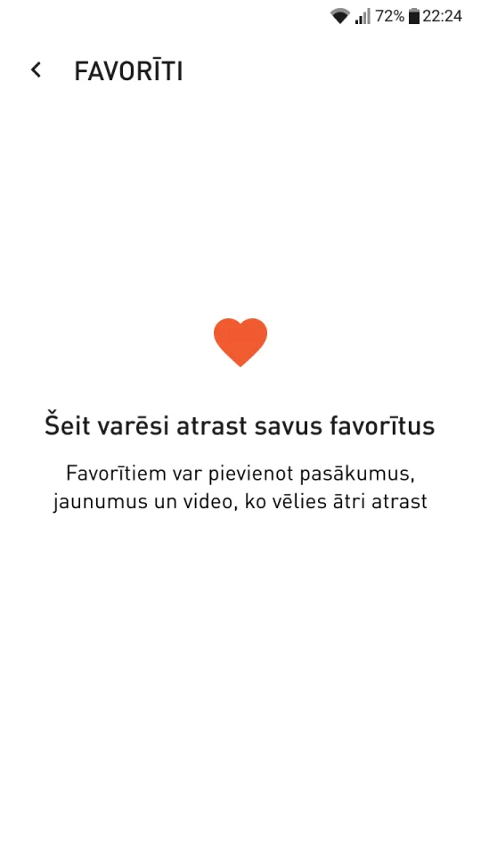
Filters by date, price, programme and discipline, plus favourites for events, news and videos — with a friendly empty state that explains what favourites are for.
We asked about the apps and platforms people use every day and what annoys them, then let them explore the prototype on their own while we took notes. Navigation and structure were clear to everyone — and the interviews surfaced the one need we hadn’t designed for: finding water, toilets and food.
We finished the design phase and handed over a tested prototype. The 2020 festival was then called off because of COVID-19, so the app was never built.
The biggest insight came from testing at the end. Short interviews before wireframing would have put participants first from day one.
Working with a national-level organisation meant long decision cycles. Short, regular reviews with stakeholders and developers kept the project moving.
White text on the festival orange and green is about 3.3:1 — below WCAG AA. Today I’d pair those colors with dark text from the start.